
Dark interiors are often misunderstood as making homes feel smaller or gloomy. In reality, when balanced with warm lighting, natural textures and thoughtful space planning, darker palettes can create elegant, inviting interiors with remarkable depth, sophistication and everyday practicality.
Dark interior palettes have become increasingly popular for homeowners seeking a more refined and timeless aesthetic. While lighter interiors maximise brightness, darker finishes introduce depth, contrast and character that can make a home feel intentionally designed rather than simply decorated. The key lies in balancing darker surfaces with lighting, material selection and spatial planning.
One of the biggest misconceptions is that dark colours automatically make a room feel cramped. In reality, poorly balanced contrast is often the real issue. By pairing charcoal cabinetry with light walls, warm timber textures and carefully positioned lighting, designers can create interiors that feel visually rich without becoming oppressive.
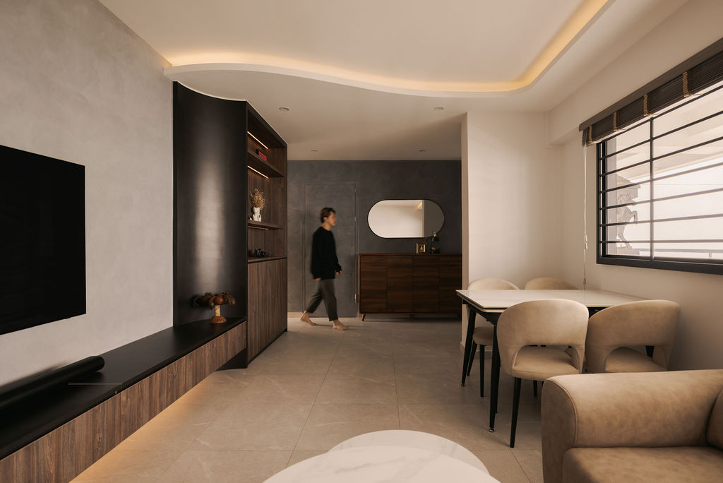
The living room demonstrates this balance particularly well. A dark timber television console and feature shelving anchor the space while introducing warmth through natural wood grain. Rather than allowing the cabinetry to dominate, the surrounding light-coloured feature wall provides contrast that keeps the room feeling open. The floating television console further contributes to this effect by exposing more floor area, reducing visual weight despite its darker finish.
Layered lighting plays an equally important role. Concealed LED strips integrated within the shelving illuminate decorative displays while highlighting the natural timber texture. Instead of relying solely on ceiling lights, indirect lighting creates subtle depth, making darker finishes appear softer and more luxurious during the evening.
Curved architectural detailing further softens the darker palette. The gently flowing ceiling profile introduces movement across the living space, preventing the room from feeling overly angular. This subtle architectural feature is complemented by rounded corners on the custom joinery, demonstrating how softer forms can balance stronger colour contrasts.
The custom display cabinet illustrates how open and closed storage can work together effectively. Open shelving provides opportunities to display books, plants and decorative objects, adding personality to the home. Meanwhile, enclosed lower cabinets conceal everyday items, helping the space remain organised without visual clutter. Integrating lighting into the shelving also improves visibility while turning functional storage into an attractive design feature.
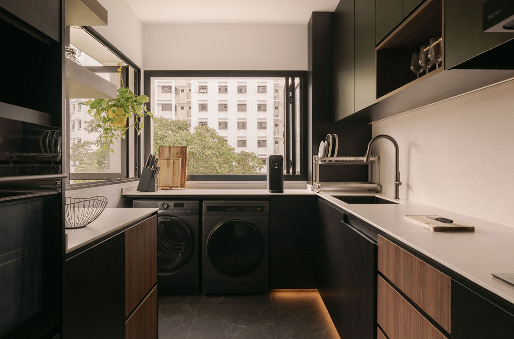
The kitchen adopts a similarly balanced approach. Matte black cabinetry is paired with walnut-inspired drawer fronts and bright white countertops to maintain visual contrast. This combination prevents the darker cabinetry from overwhelming the relatively compact galley layout while adding warmth that pure monochromatic schemes sometimes lack.
Lighting beneath the base cabinets creates a floating appearance that visually lightens the lower cabinetry while providing practical illumination for navigating the kitchen during the evening. White countertops further reflect natural daylight from the large window, enhancing brightness within the workspace and making food preparation more comfortable.
Storage planning remains central to the kitchen's functionality. Full-height cabinetry houses built-in appliances while keeping countertops clear for daily use. Open timber shelves near the preparation area provide convenient access to frequently used items such as spices, jars and kitchen accessories without requiring additional upper cabinets that could make the room feel enclosed.
The study demonstrates another advantage of darker palettes. Floor-to-ceiling wardrobes blend seamlessly into the room, allowing storage to become part of the architectural design rather than appearing as separate furniture pieces. A window-side study nook introduces natural daylight, ensuring the darker cabinetry remains balanced throughout the day while creating a comfortable workspace.
Material consistency helps unify the home. Similar dark timber finishes, charcoal cabinetry and warm lighting are repeated across the living room, kitchen and study, creating continuity between spaces. This restrained material palette prevents the design from feeling fragmented while allowing each room to maintain its own function.
Lighting colour temperature is equally important in darker interiors. Warm white lighting enhances timber tones and softens black surfaces, creating a welcoming atmosphere. Cooler lighting, by comparison, may make darker finishes appear flat or sterile. By carefully selecting warm lighting throughout the home, the interior achieves a cosy ambience without sacrificing clarity or functionality.
Contrast also extends beyond colour. Smooth white countertops sit alongside textured timber grain, matte cabinetry and subtle stone-inspired surfaces, allowing different materials to complement one another. This layered material approach creates visual richness without introducing unnecessary colours or decorative elements.
Ultimately, dark interiors succeed when every element works together. Rather than relying on colour alone, successful designs combine balanced contrast, integrated storage, layered lighting and carefully selected materials to create homes that feel sophisticated, functional and comfortable. When executed thoughtfully, darker palettes offer timeless elegance while remaining practical for everyday living.
Not necessarily. When paired with lighter surfaces, natural daylight and layered lighting, darker colours can create depth that makes spaces feel more refined rather than confined.
Use reflective countertops, warm under-cabinet lighting, large windows where possible and a balanced combination of light and dark materials to maximise brightness.
Warm lighting enhances timber textures, softens dark finishes and creates a welcoming atmosphere while highlighting architectural details and built-in joinery.
Natural timber, light stone-inspired surfaces, white countertops and matte finishes provide contrast that prevents dark cabinetry from feeling overly heavy.
Limit the colour palette, prioritise quality materials, integrate storage seamlessly and use architectural details instead of relying on short-lived decorative trends.