
Bold colour can work successfully in a home when it is applied with control. In this residence, navy blue is used as an anchor rather than across every surface, while timber, soft greys, and warm lighting prevent the interior from feeling too dark. The result shows how strong colour, practical storage, and personal collections can be combined within a cohesive contemporary design.
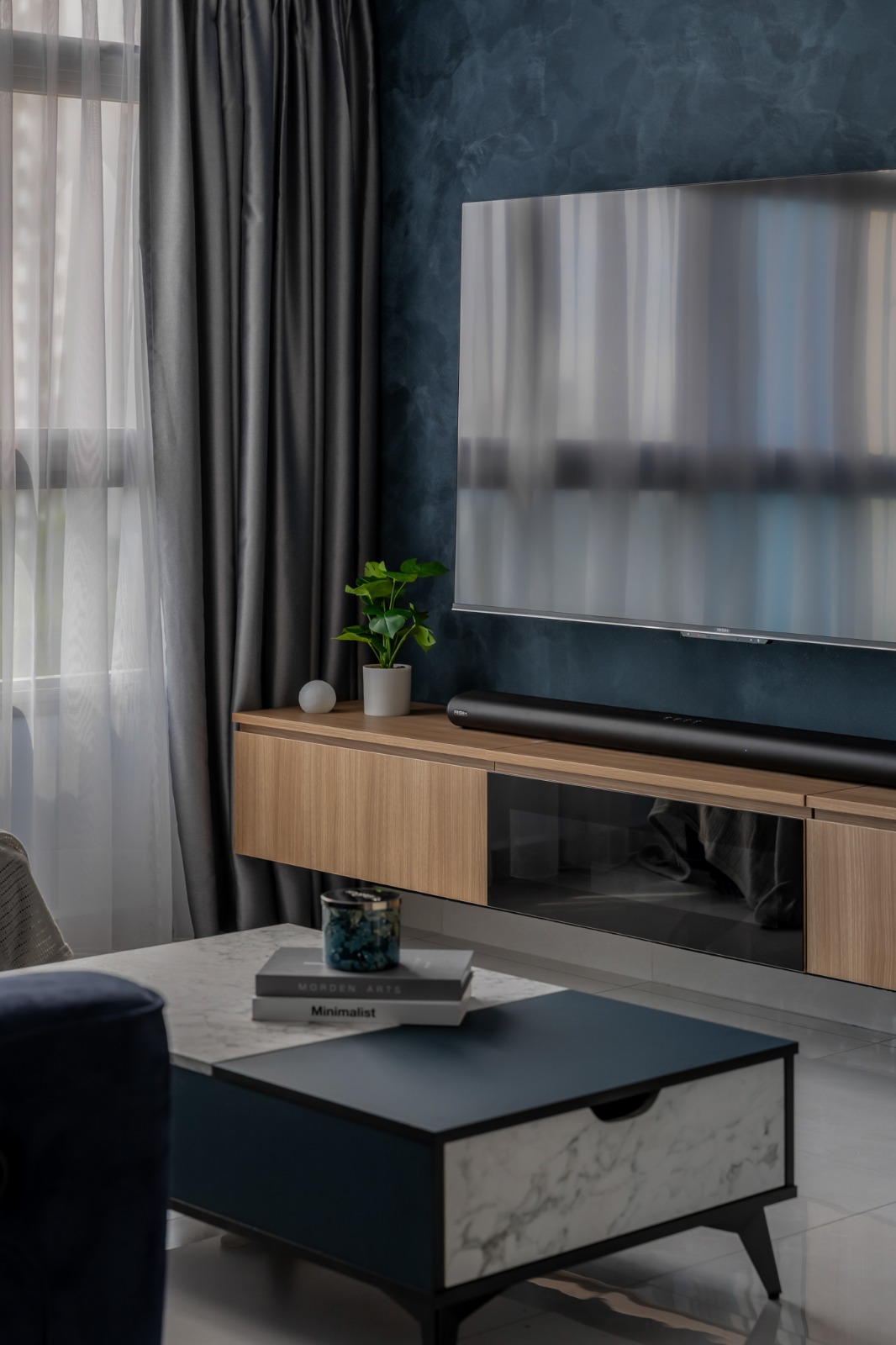
Using dark blue in an interior requires careful control of proportion, lighting, and surrounding materials. Large areas of deep colour absorb more light than pale finishes, so they are most effective when balanced with brighter walls, reflective surfaces, and natural daylight. In this home, navy is concentrated on selected feature walls, cabinetry, and display zones. This gives the interior a clear visual identity without making every room feel enclosed.
Timber plays an important supporting role because its warm undertone offsets the coolness of blue. The combination creates contrast while remaining comfortable and familiar. Pale flooring and lighter wall finishes further reduce the visual weight of the darker cabinetry. This is an important principle when using saturated colours in compact homes: the darker element should usually be framed by lighter surfaces so that the room retains depth and openness.
The display cabinets are also planned as part of the architecture rather than added later as loose furniture. Glass-fronted storage protects collectibles from dust while allowing them to remain visible. Integrated lighting improves visibility and creates focal points, but it should be positioned carefully to avoid harsh reflections on glass. Warm light is used here because it softens the blue finishes and enhances timber tones.
Storage is distributed vertically to make better use of wall height. Full-height cabinetry reduces the need for multiple loose storage pieces, helping circulation remain clear. In the study, enclosed cabinets, open display shelves, and a long worktop support different functions within one compact room. This demonstrates why storage planning should consider what needs to be hidden, what should remain accessible, and what deserves to be displayed.
The bathrooms use a more restrained palette because smaller enclosed spaces can feel visually heavy when too many dark surfaces are introduced. Large-format tiles reduce grout lines, while illuminated mirrors provide more even facial lighting than a single ceiling light. Wall-mounted vanities also expose more floor area, making cleaning easier and helping the bathroom appear less crowded.
Overall, the design shows that a personalised home does not need to appear cluttered. Strong colours and collections can be incorporated successfully when they are supported by clear zoning, controlled contrast, integrated storage, and a layered lighting plan.
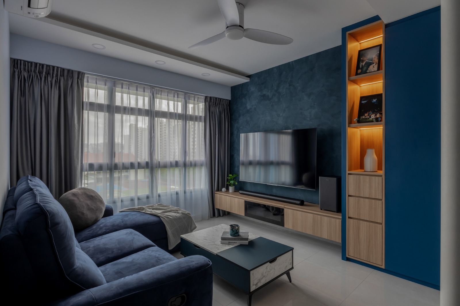
Dark colours are usually most effective on selected walls, cabinetry, or focal areas rather than throughout the entire space. Keeping surrounding surfaces lighter helps preserve brightness and visual balance.
Timber introduces warm undertones that soften the coolness of navy. It also adds natural texture, preventing the overall scheme from feeling flat or overly formal.
Warm lighting generally makes deep blue feel more inviting and enhances timber finishes. Cooler lighting can make the same colour appear sharper and more clinical.
Layered lighting combines ambient, task, and accent lighting to create flexibility throughout the day, improving functionality while introducing warmth and visual depth.
Use full-height cabinetry to maximise capacity, but break up large surfaces with recesses, open shelves, glass panels, or lighter finishes. Floating elements can also expose more floor area.