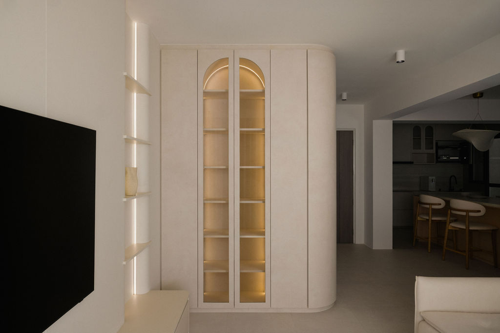
Minimalist homes can sometimes feel overly rigid when every cabinet, wall and opening follows straight lines. Introducing curves in carefully selected areas creates a softer alternative without sacrificing the simplicity that makes minimalism appealing. In this home, rounded cabinetry, arched glass displays, illuminated shelving and a restrained neutral palette work together to create an interior that feels calm, continuous and visually spacious.
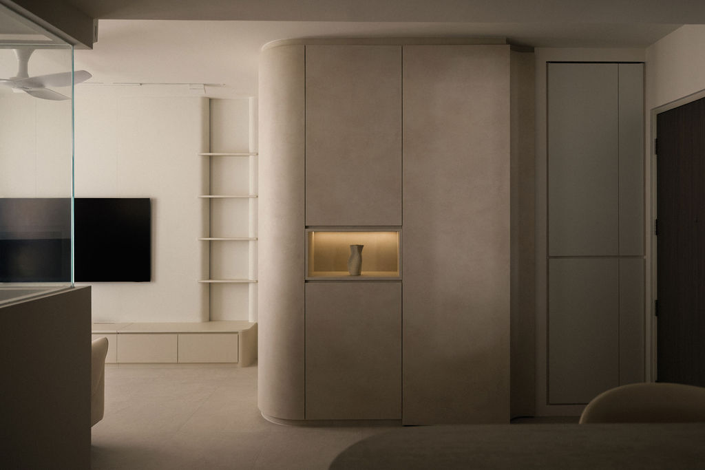
Minimalist interior design is often associated with clean lines, concealed storage and simple colour palettes. While these principles help reduce visual clutter, relying exclusively on straight edges and rectangular forms can sometimes make a home feel rigid. One way to introduce warmth without adding unnecessary decoration is through architectural curves.
The key is not to make every element curved. Instead, curves work best when they appear strategically at transitions, corners and focal points where they can influence how the eye moves through the home. This project demonstrates how relatively subtle changes to the shape of cabinetry and openings can soften an otherwise highly restrained interior.
The living room establishes this approach immediately. The TV feature wall remains intentionally simple, with a large uninterrupted surface and low storage console keeping attention on the overall proportions rather than decorative detailing. Beside it, however, a vertical display feature introduces rounded corners and slim illuminated shelves. The contrast between the flat television wall and the sculptural shelving gives the elevation more depth without making it visually busy.
Lighting plays an important role here. Vertical concealed lighting traces the display feature and creates a warm glow around the shelves. Instead of illuminating the entire wall evenly, the lighting emphasises its shape and produces gentle shadows around the curved surfaces. This makes the architectural detailing more noticeable in the evening while still maintaining the home's restrained character.
The adjoining full-height storage continues the same design language. Rather than ending the cabinetry with a conventional square corner, the outer edge transitions into a generous radius. This is particularly effective in areas where people frequently walk past large built-ins. Visually, the rounded edge makes the cabinet appear less bulky, while physically it creates a gentler transition around the circulation route.
Arched glass-front cabinets introduce another variation of the curve. The tall proportions preserve useful storage and display space, but the rounded tops prevent the cabinetry from becoming a repetitive wall of rectangular doors. Warm internal lighting turns selected compartments into display zones, allowing decorative pieces to contribute personality while the surrounding closed cabinets conceal everyday belongings.
This balance between display and concealed storage is especially useful in minimalist homes. Completely open shelving can quickly create visual clutter, while fully concealed cabinetry may feel too plain. Combining the two allows homeowners to keep practical belongings hidden while reserving a smaller amount of space for objects they genuinely want to see.
Curves also help connect different rooms visually. From the living area, similar rounded forms can be seen across several built-in elements, creating a consistent architectural language rather than treating each space independently. Even when individual functions change, the repetition of these forms gives the home a stronger sense of continuity.
The dedicated study provides an interesting example of how openness can be maintained without removing functional separation altogether. A large glazed partition visually connects the workspace with the living area, allowing sightlines and light to continue between the two zones. This helps the enclosed study feel less isolated while still creating a defined environment for working.
In the kitchen, the design becomes more linear because practicality takes priority. Full-height and overhead cabinetry maximises storage, while a generous island provides additional preparation space and seating. However, the same warm neutral palette prevents the kitchen from feeling disconnected from the softer living area.
The island also demonstrates why large surfaces do not necessarily make a room feel heavy. Keeping the countertop, cabinetry and surrounding finishes within a closely related range of warm neutral tones reduces visual fragmentation. Instead of perceiving every cabinet and surface as a separate object, the eye reads the kitchen as a more unified composition.
Subtle material texture becomes particularly important when working with such a limited colour palette. Rather than introducing strong colour contrasts, variation comes from softly textured surfaces, glass, gentle reflections and warm illumination. These differences provide enough depth to prevent the interior from appearing flat while preserving its quiet atmosphere.
Ultimately, using curves successfully in a minimalist home is an exercise in restraint. Rounded corners and arches are most effective when they solve transitions, soften substantial built-ins or highlight specific architectural moments rather than becoming decoration applied everywhere.
Combined with integrated storage, warm lighting and a consistent neutral palette, these details can make a highly functional home feel noticeably gentler. The result is a form of minimalism that remains clean and organised but feels comfortable, fluid and suited to everyday living.